KAIKA TOKYO
Identities
- Client
- ReBITA Inc.
- Interior Design
- POINT
- Design
- Yoshihisa Tanaka
- Art Planning and Coordination
- Kentaro Takayama(Noetica, Inc)
- Tenant Gallery
- CLEAR GALLERY TOKYO, KOSAKU KANECHIKA, NANZUKA, Yoshimi Arts, VOILLD, YUMIKO CHIBA ASSOCIATES
- Product sales MD and Promotion Cooperation
- method inc.
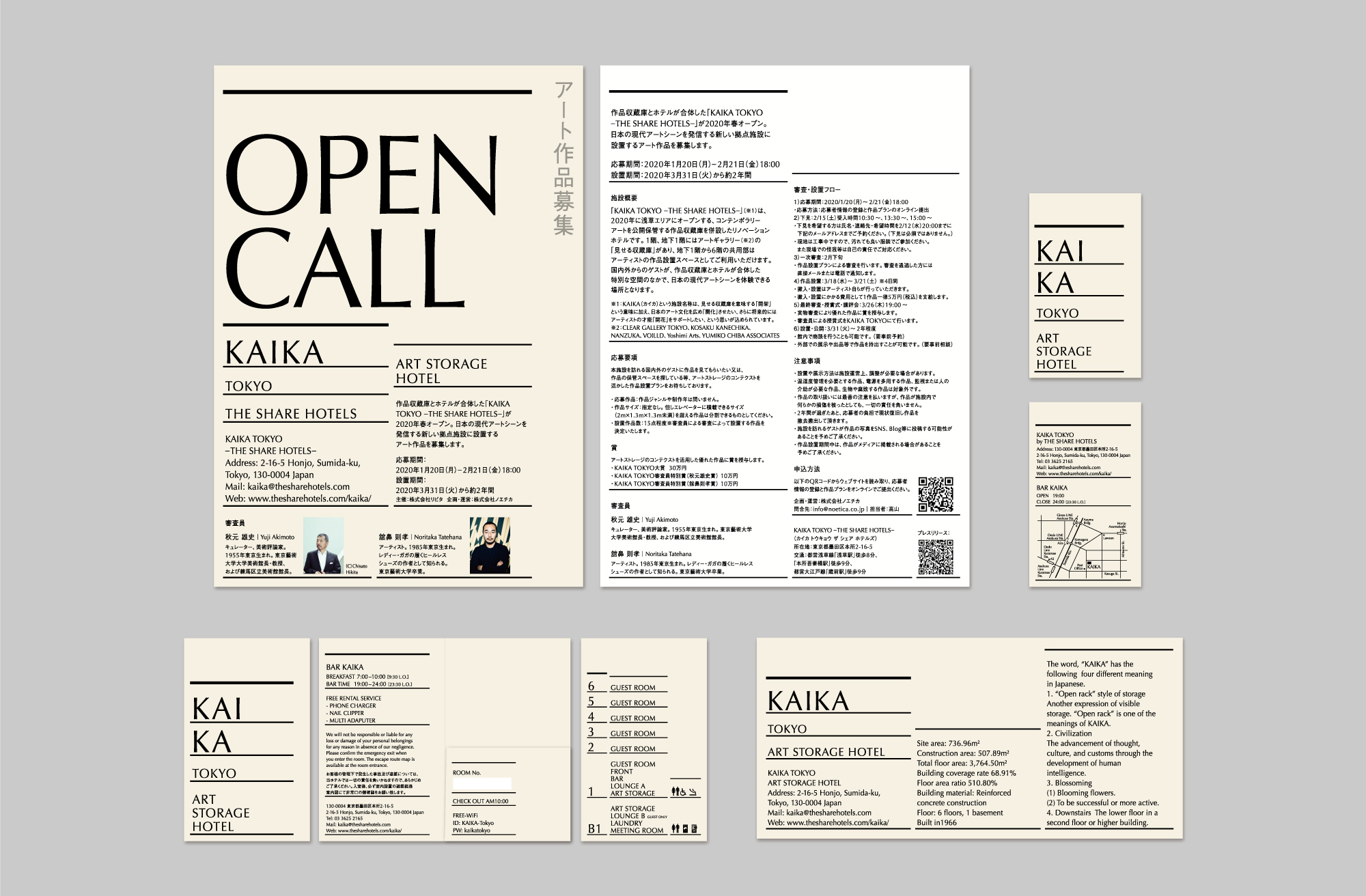
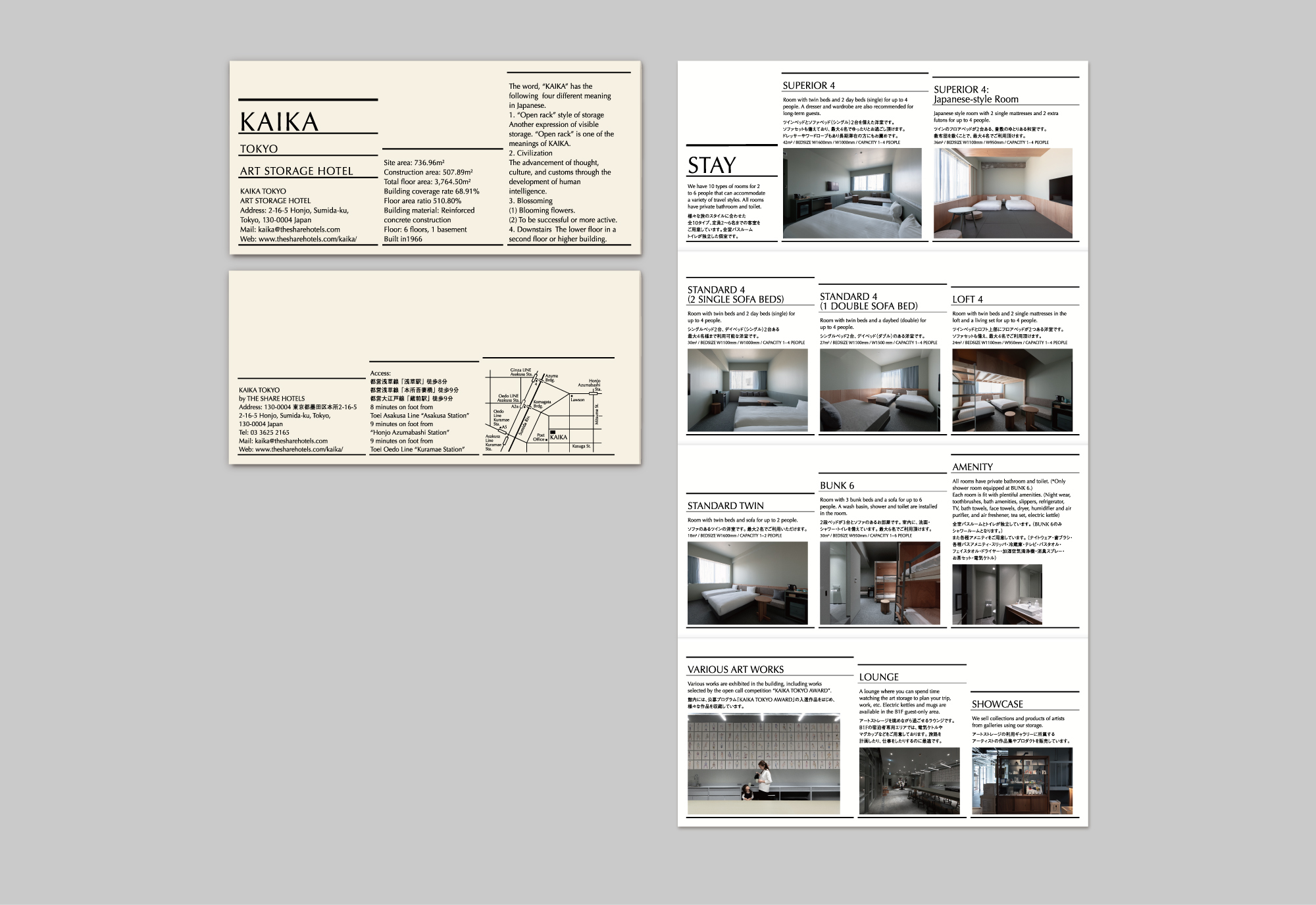
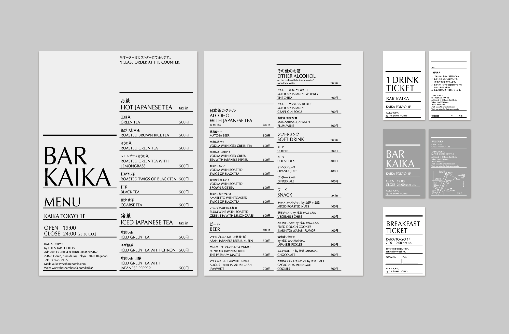
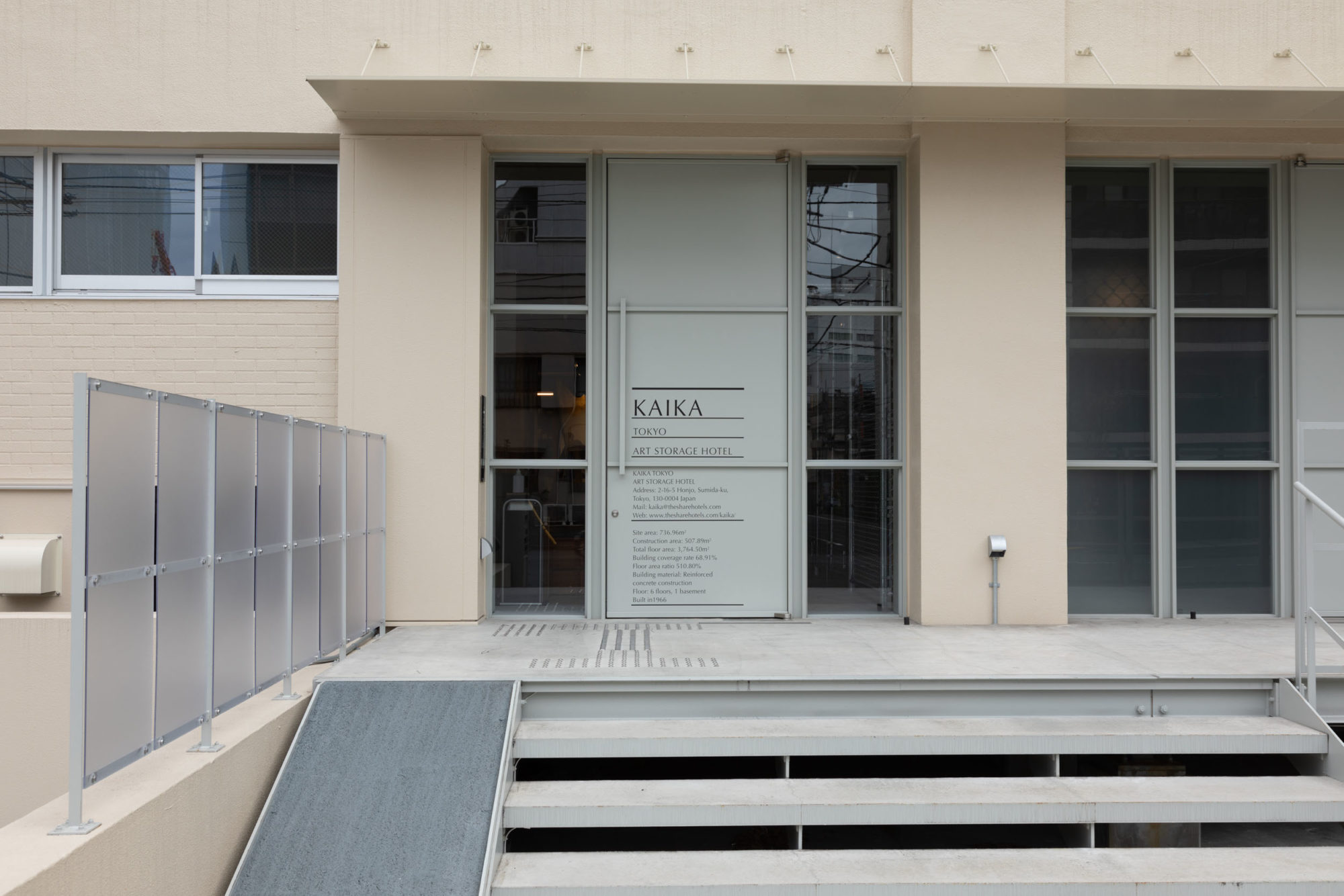
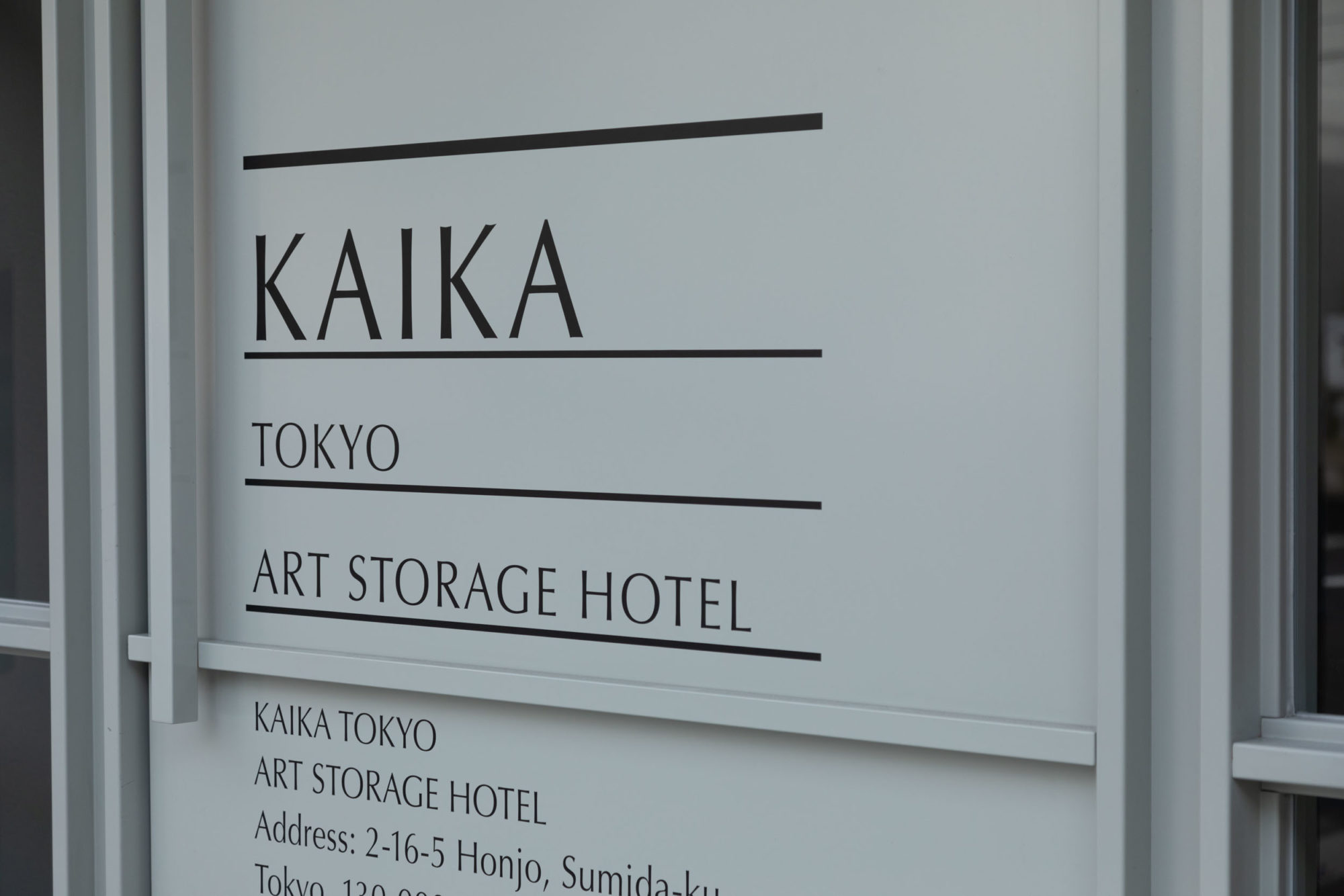
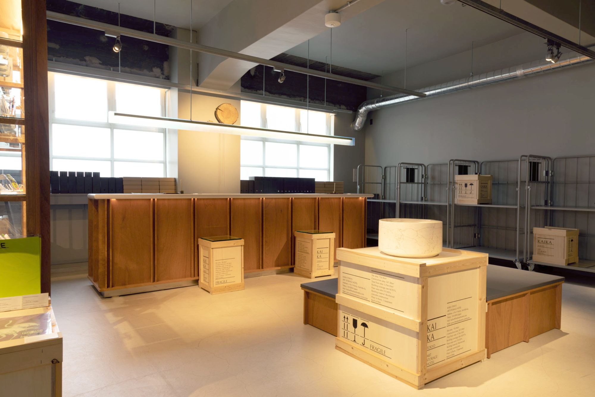
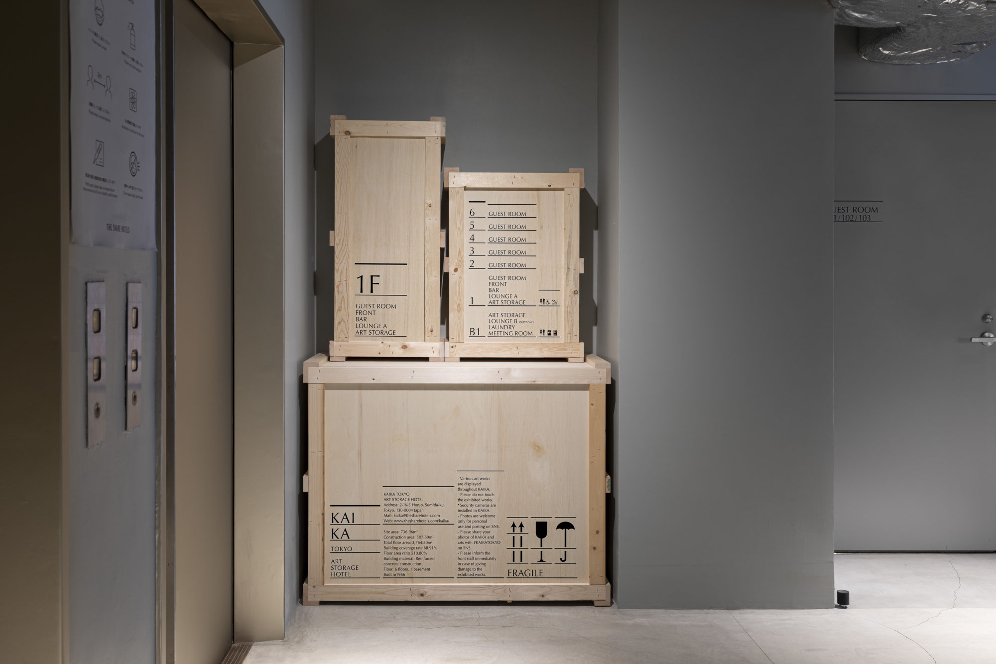
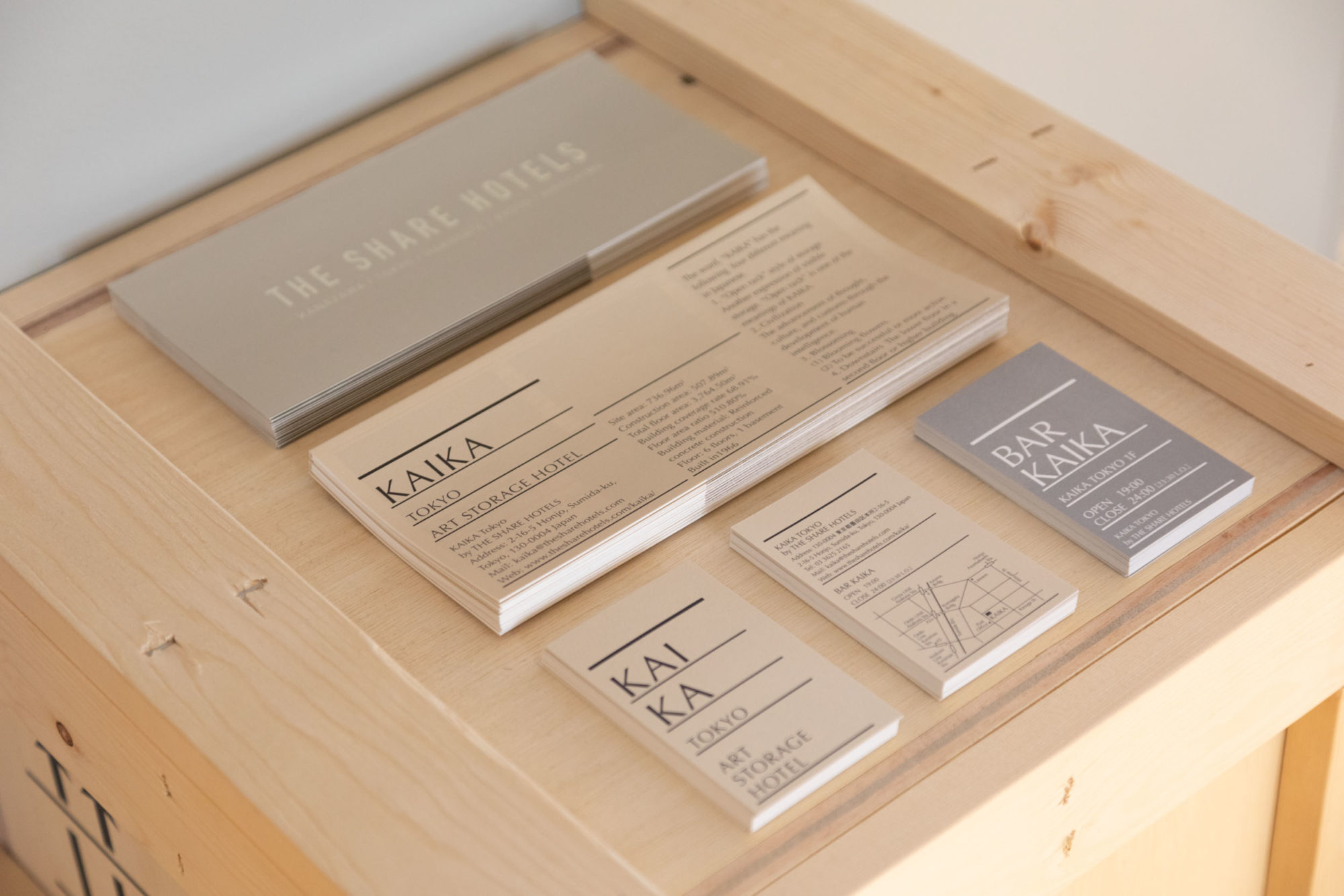
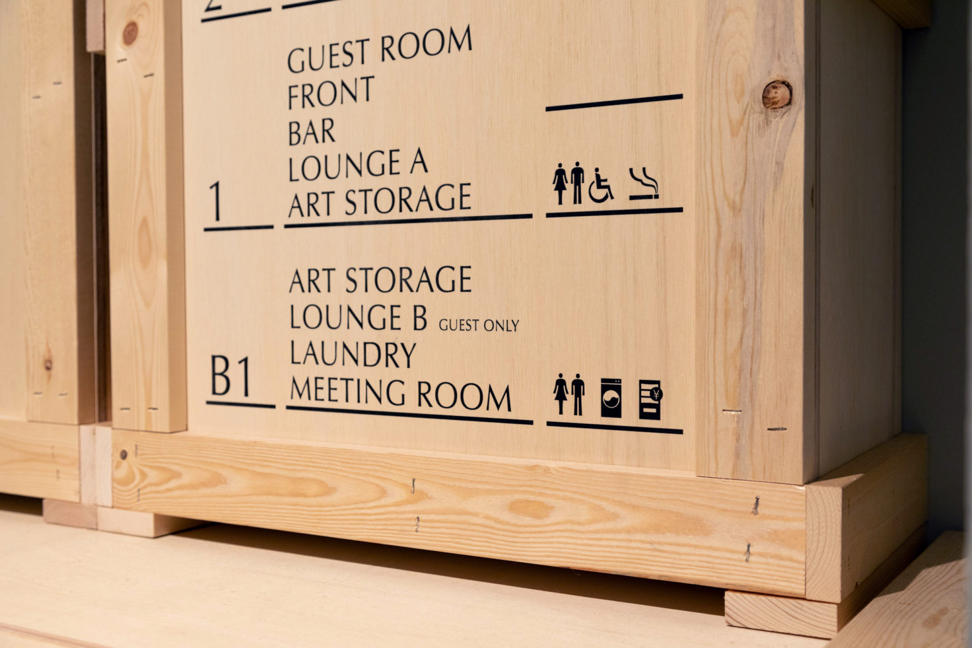
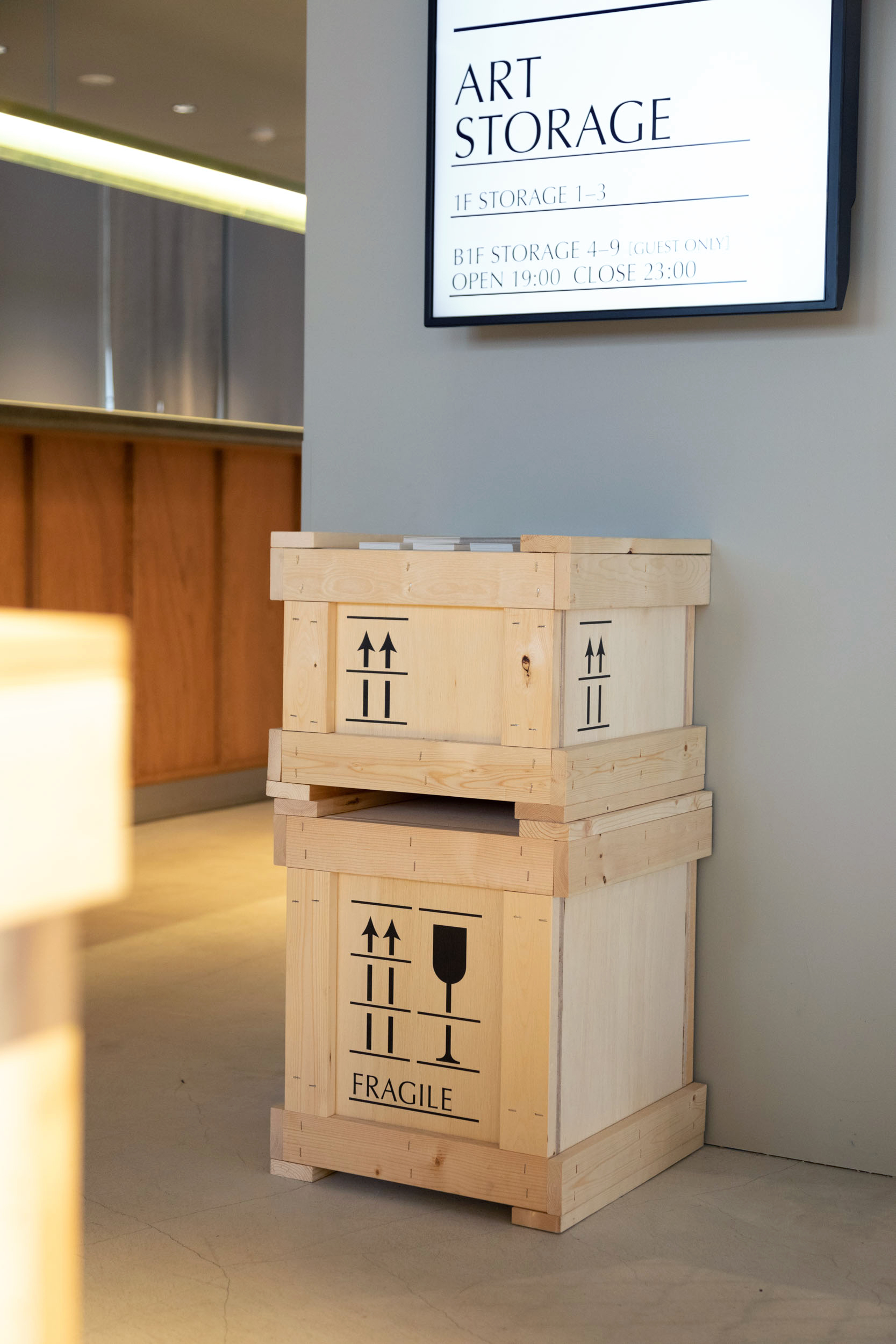
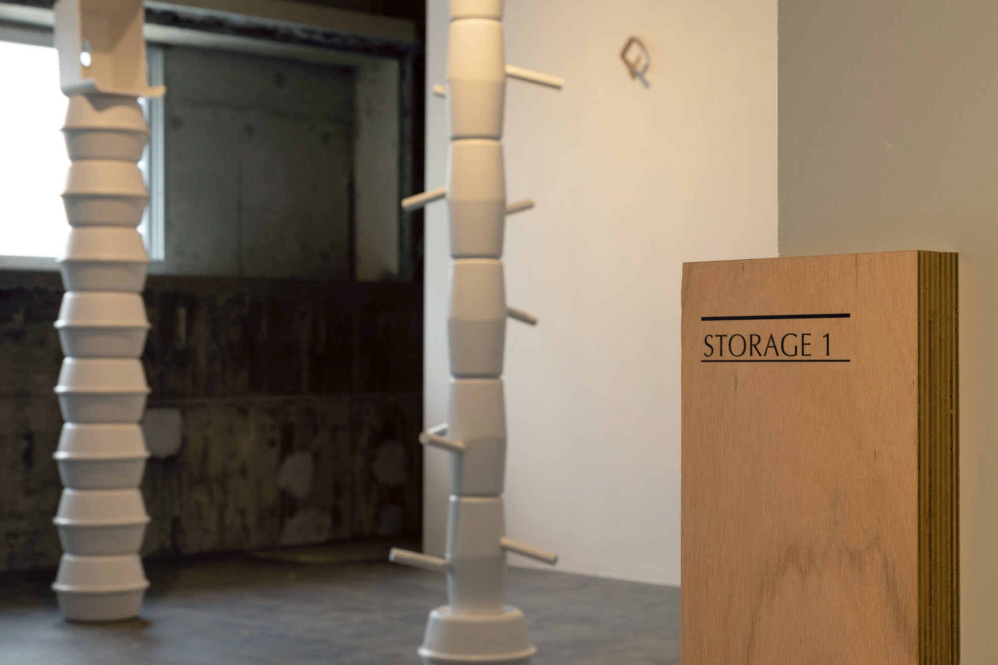
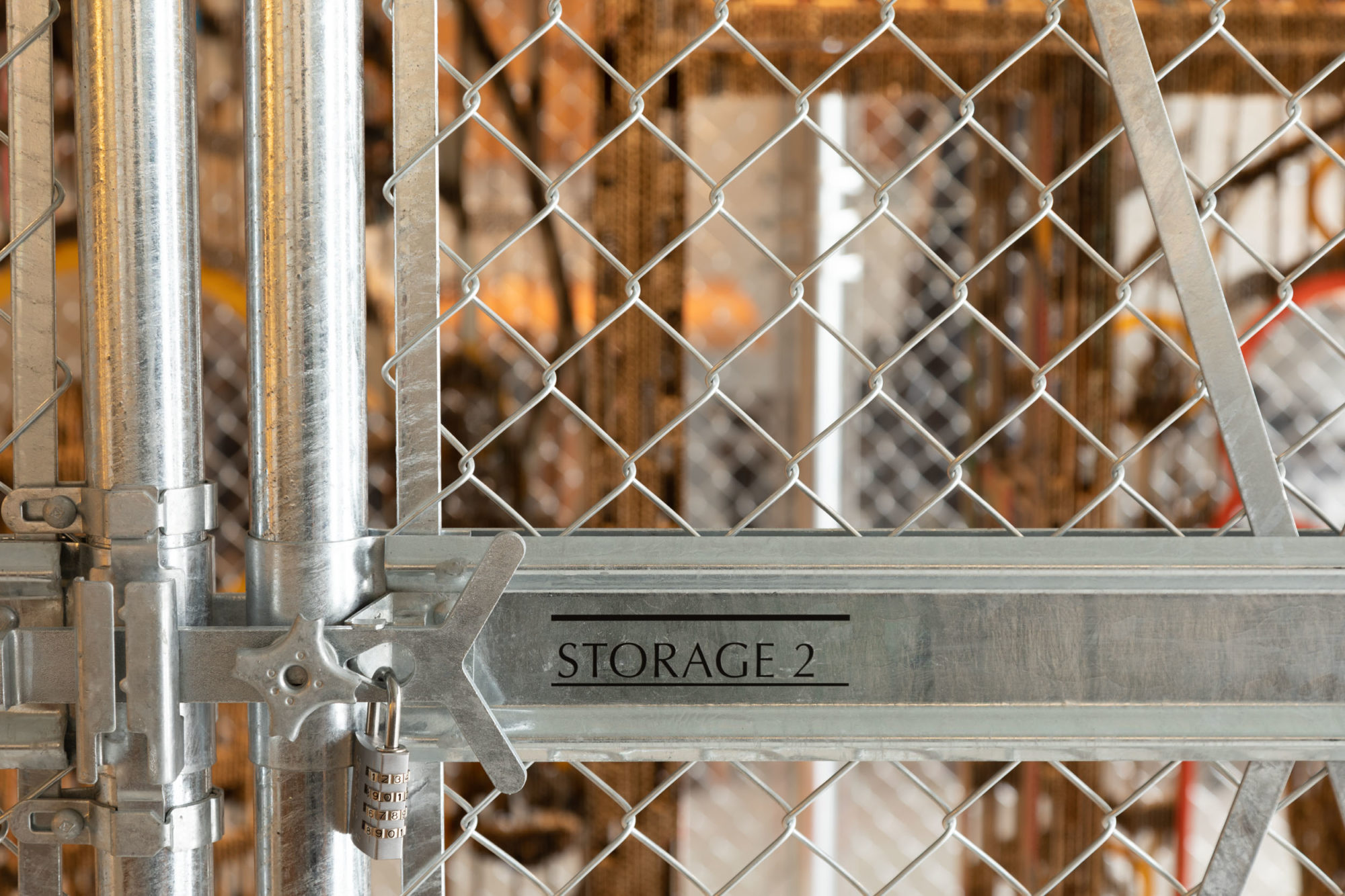
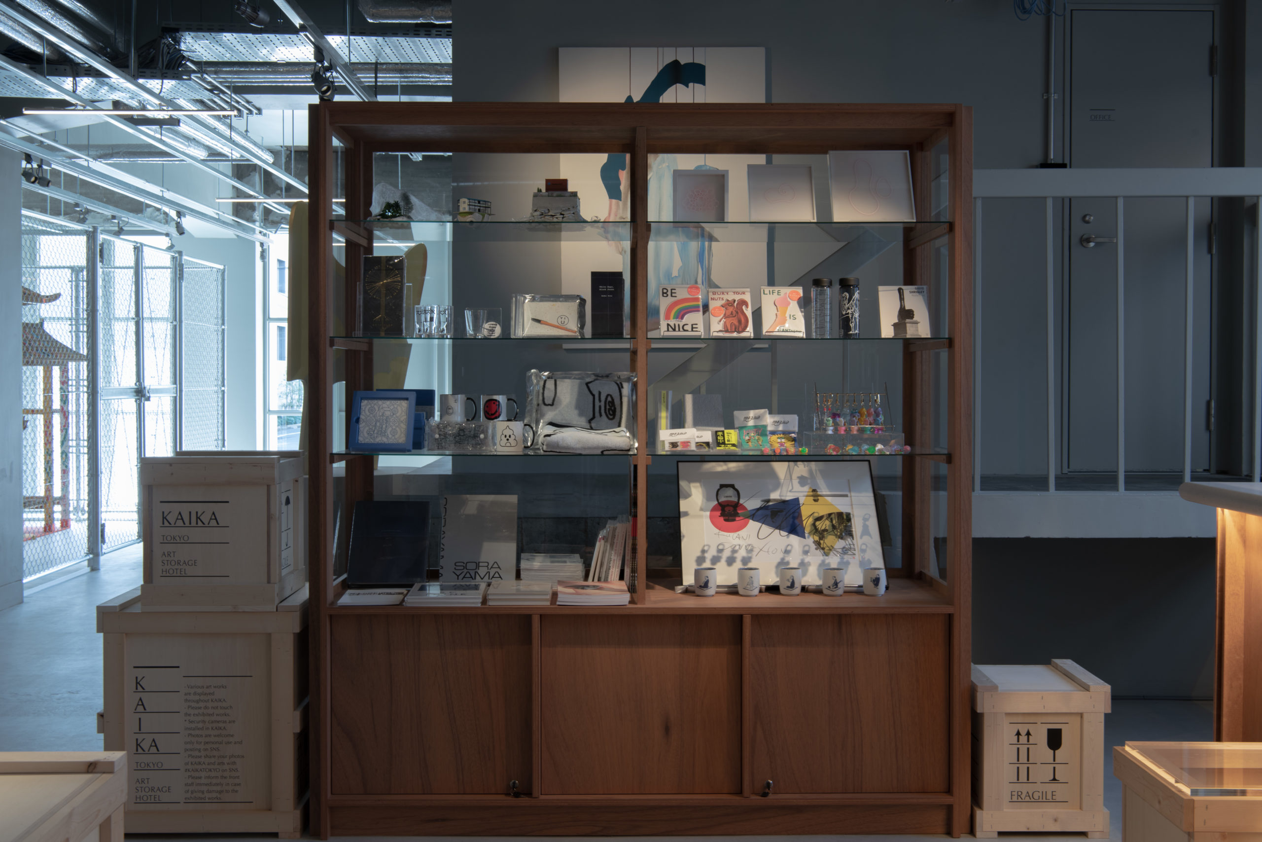
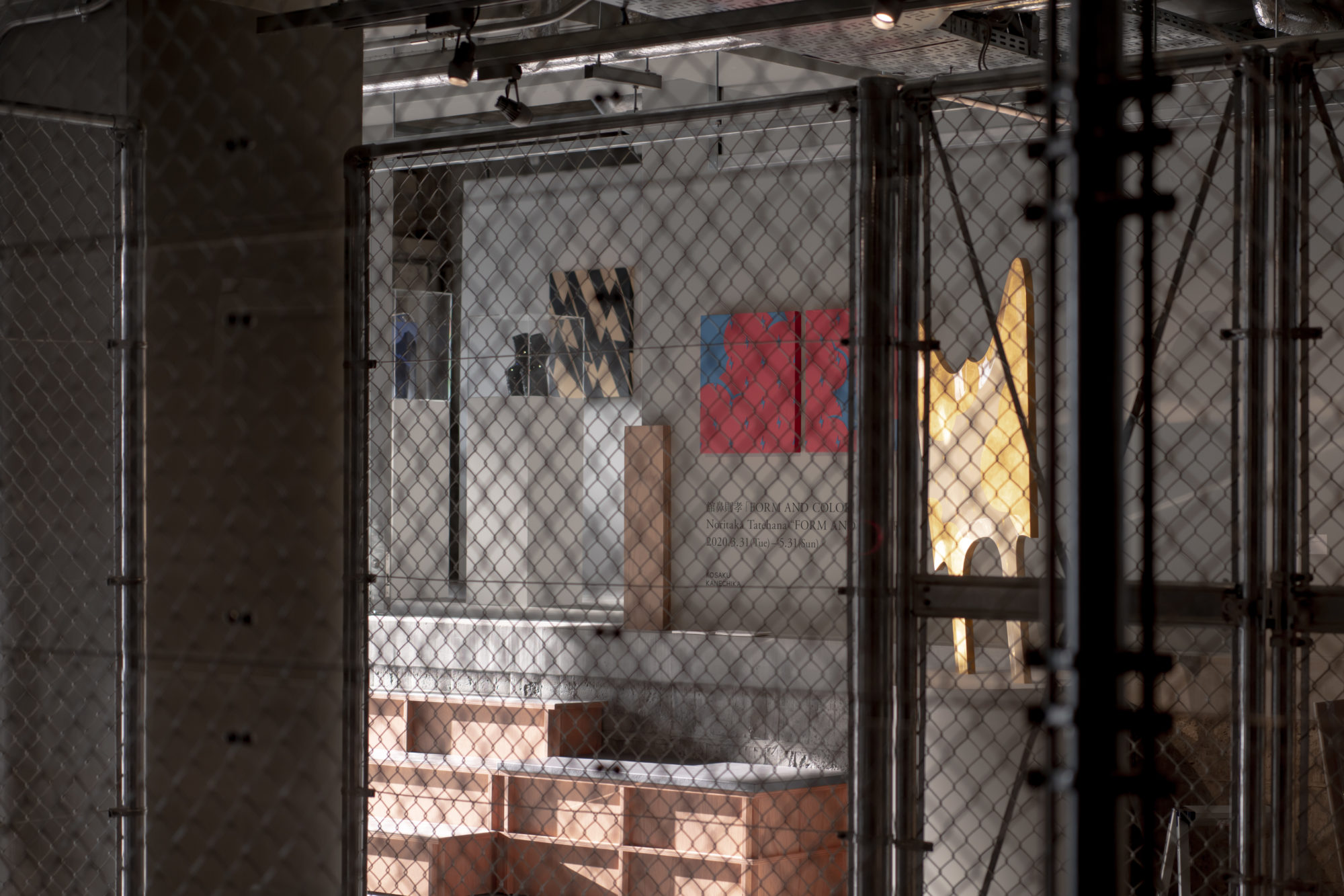
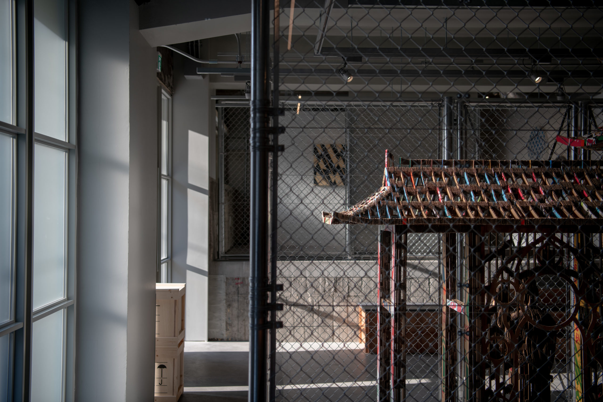
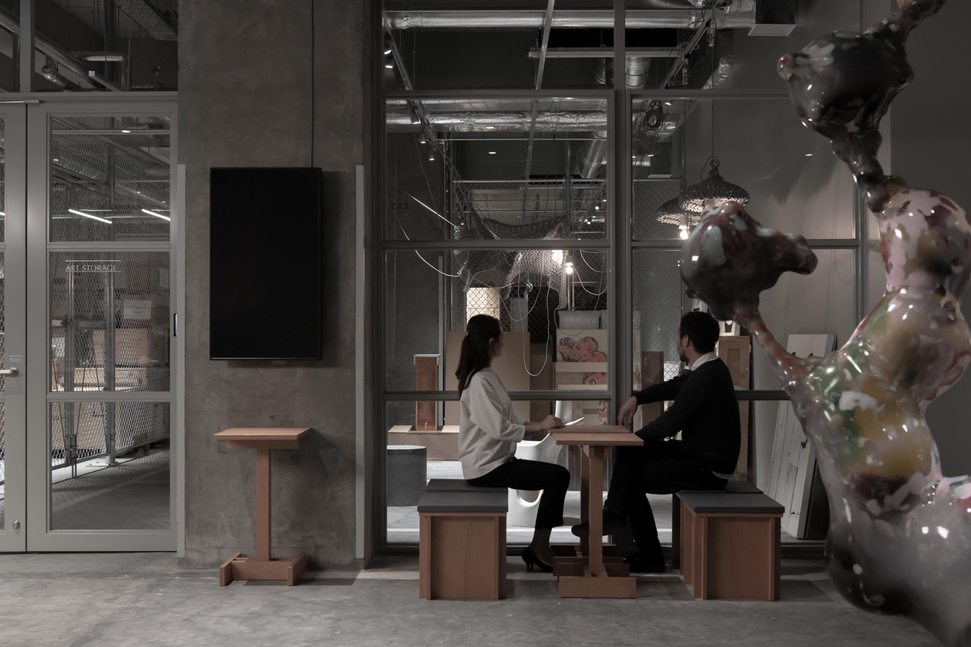
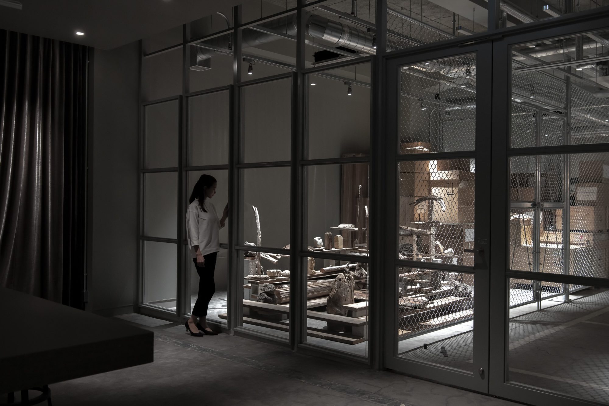
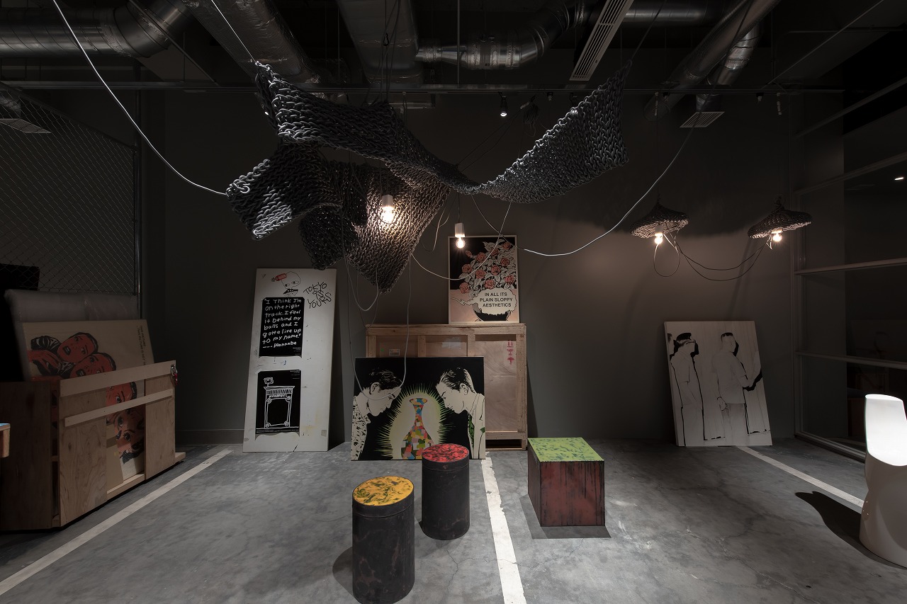
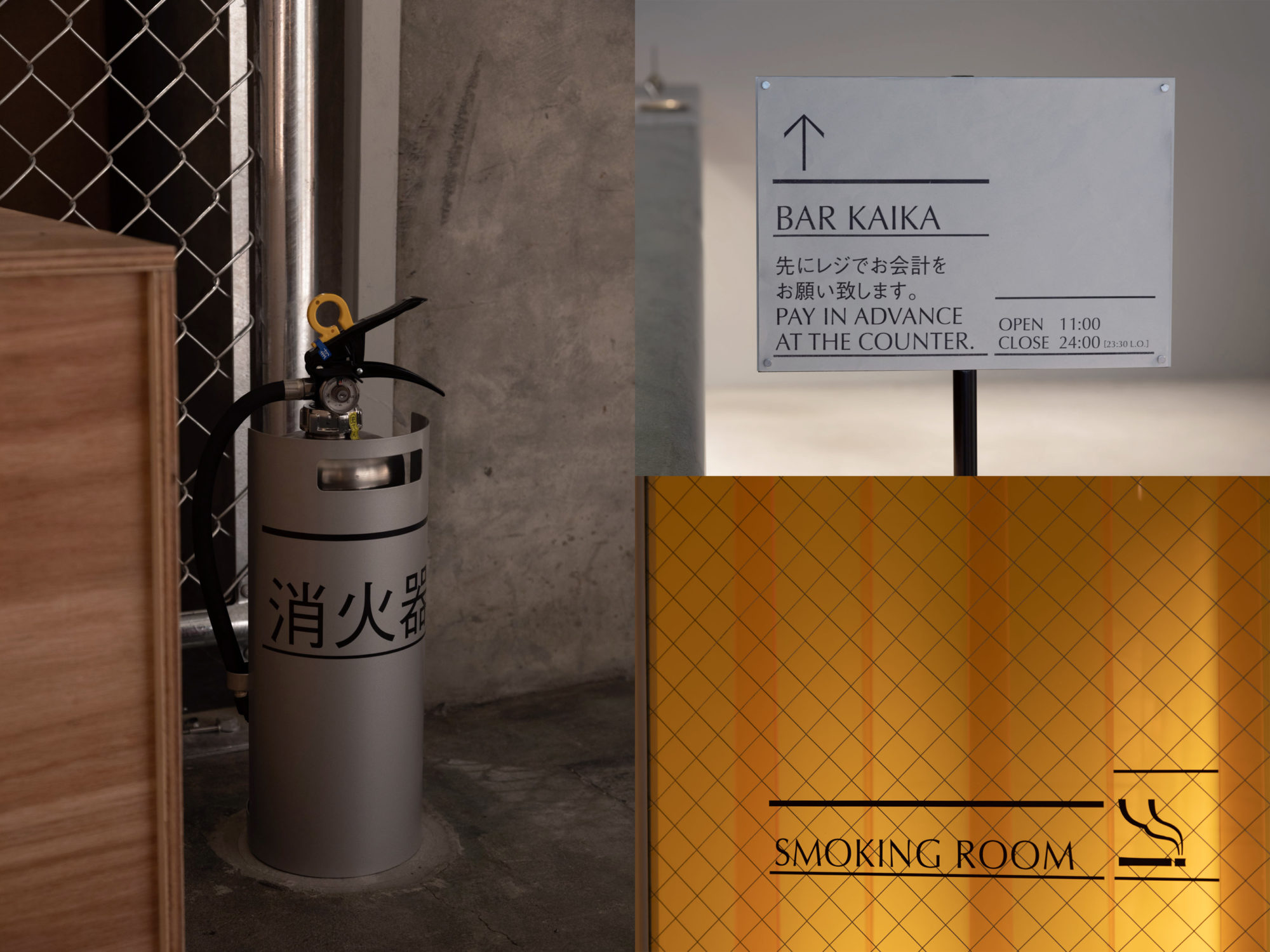
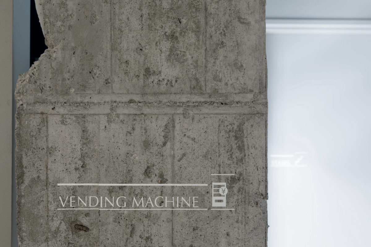
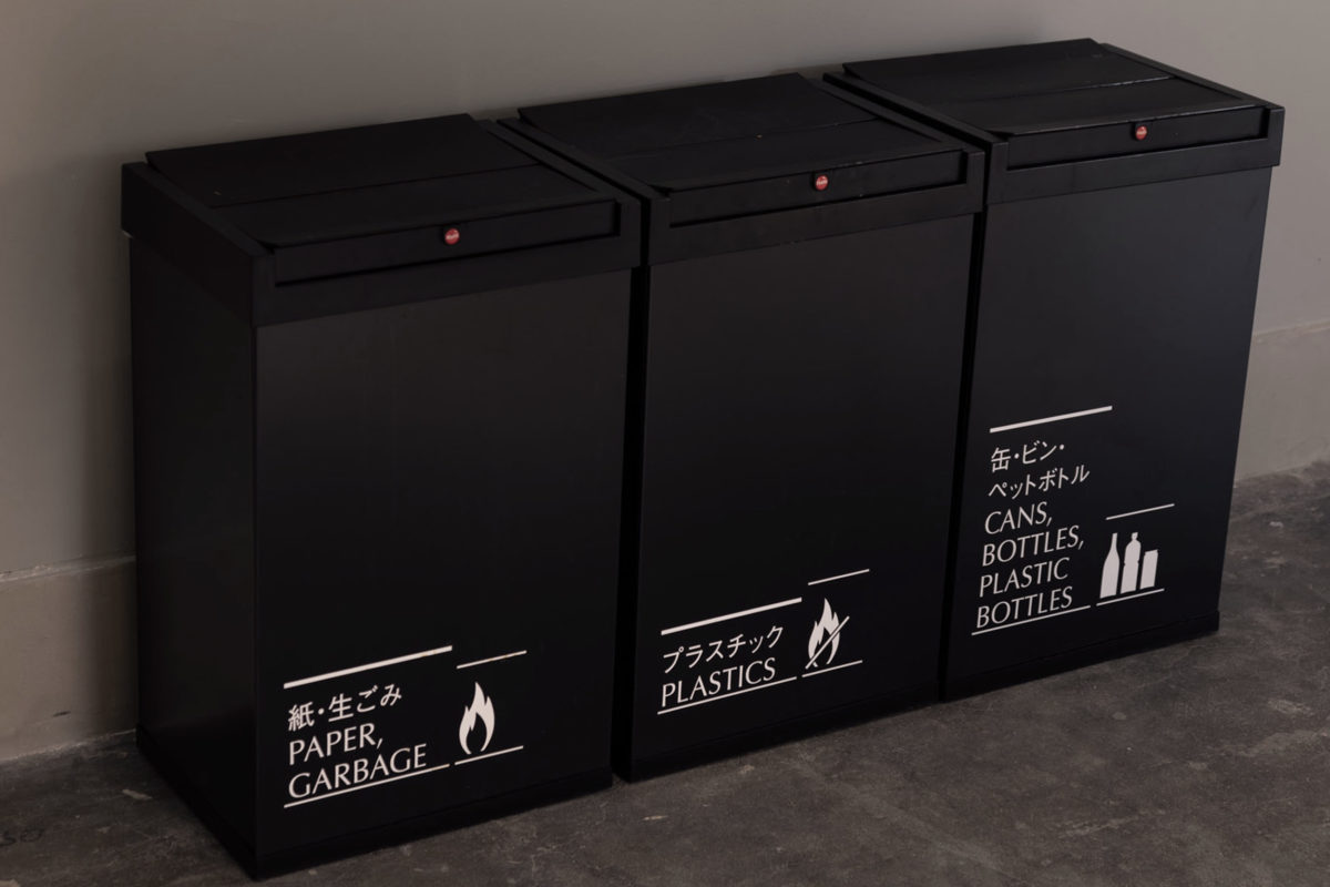
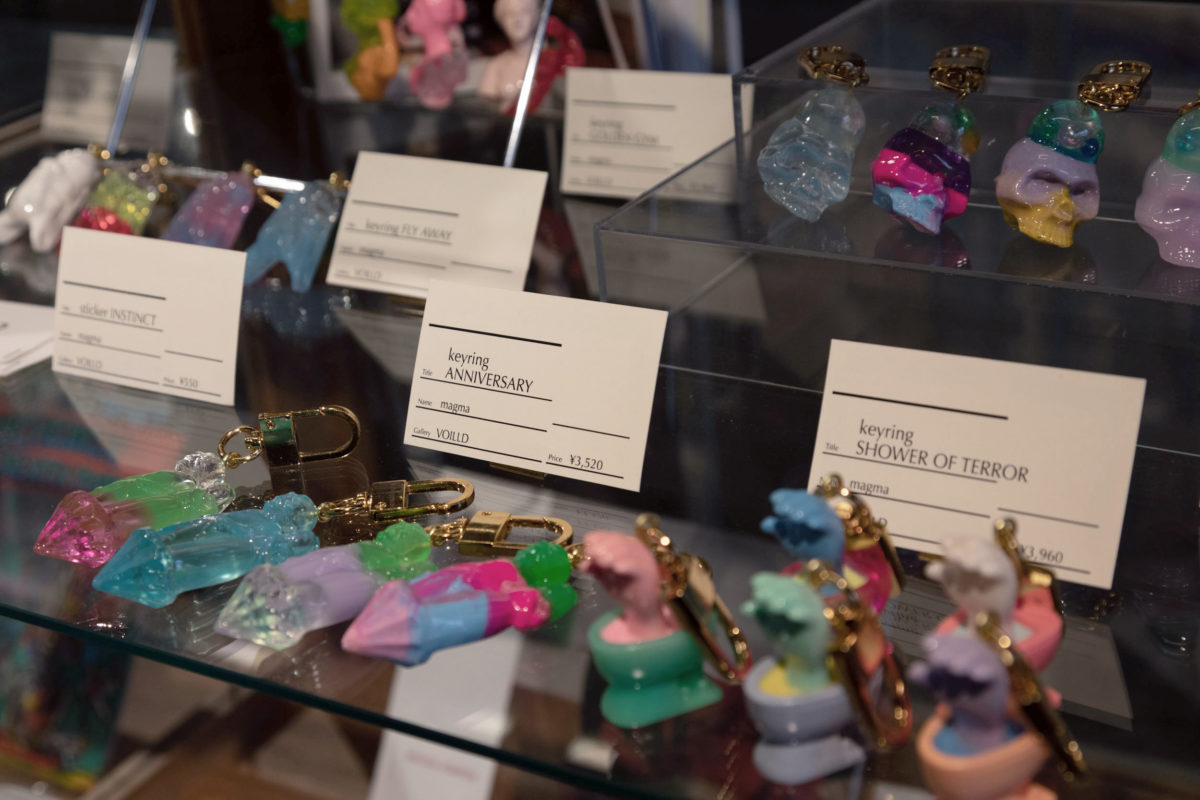
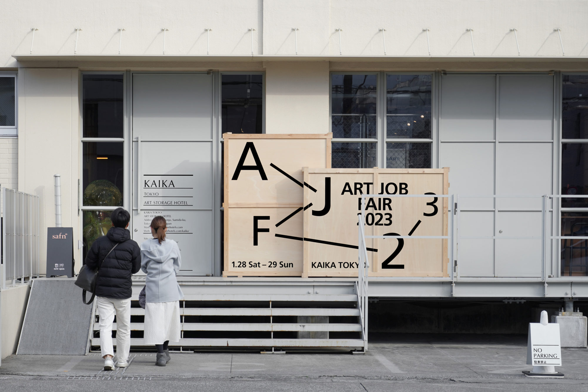
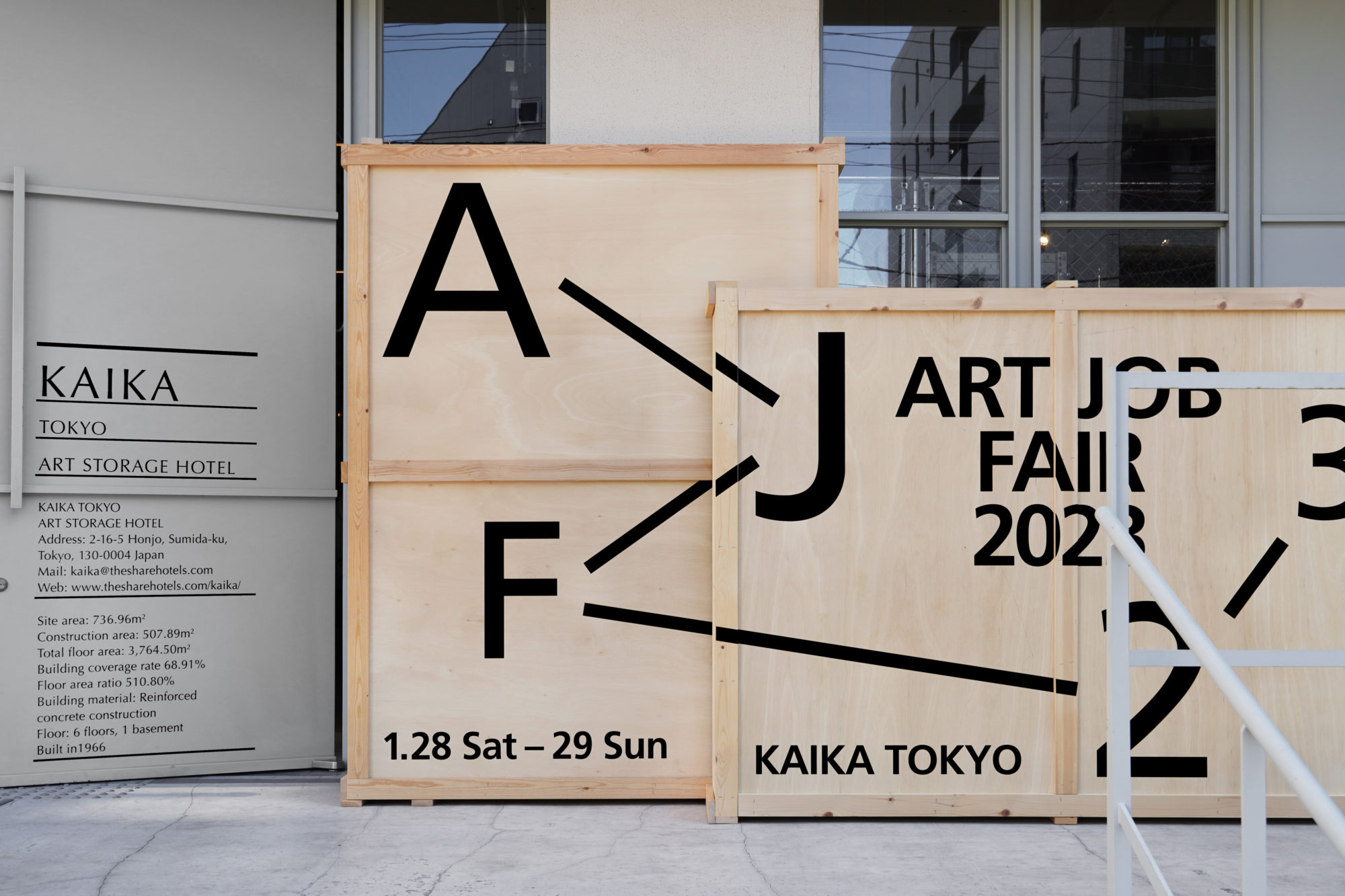
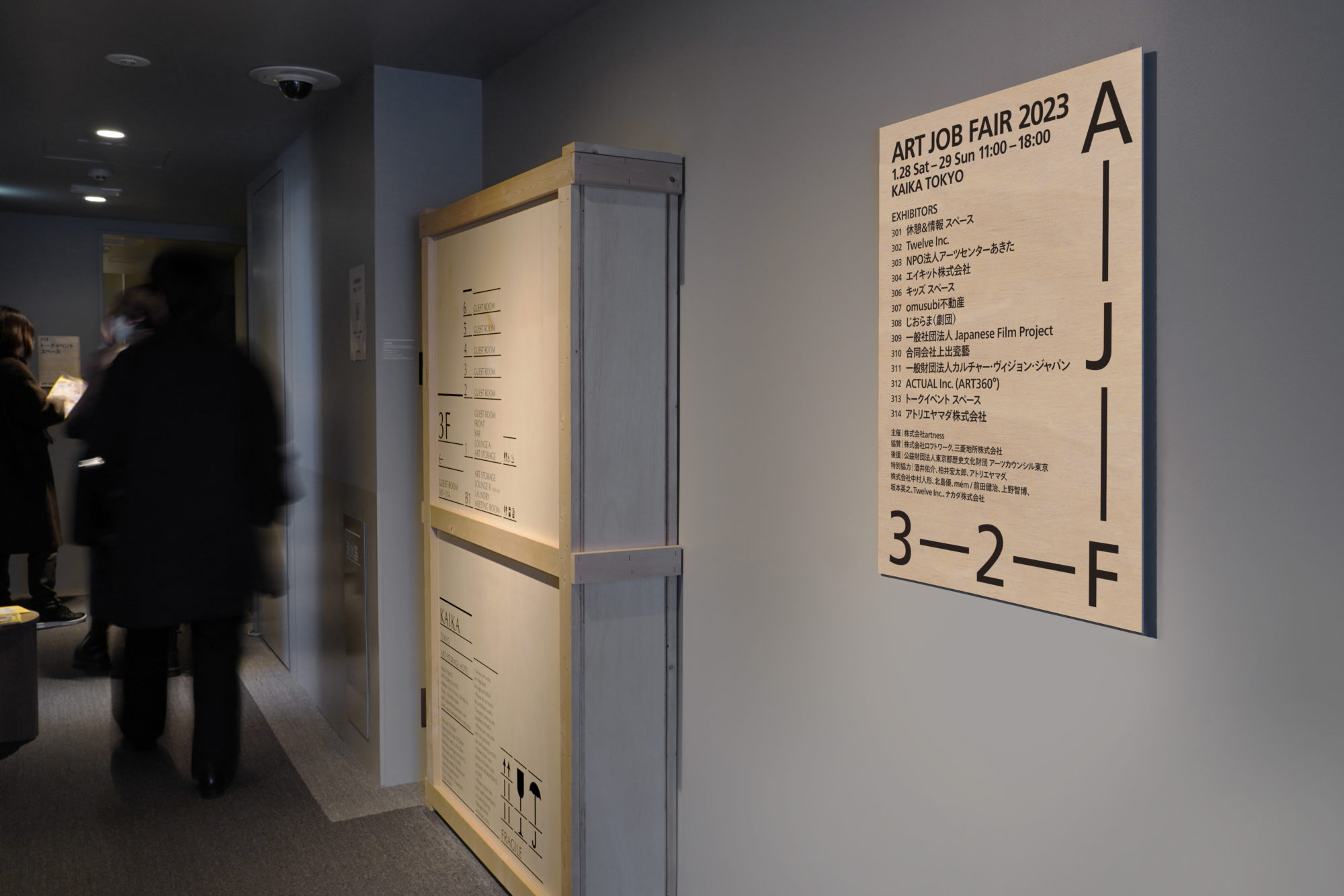
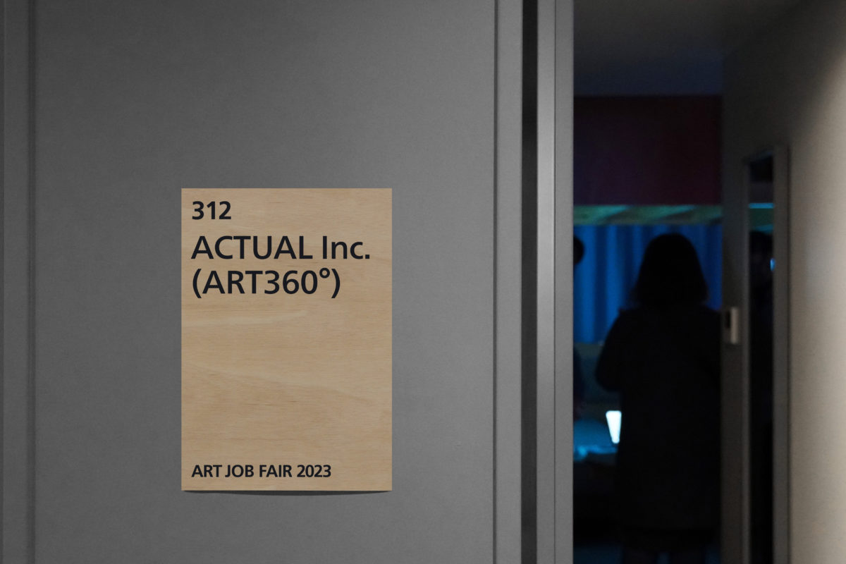
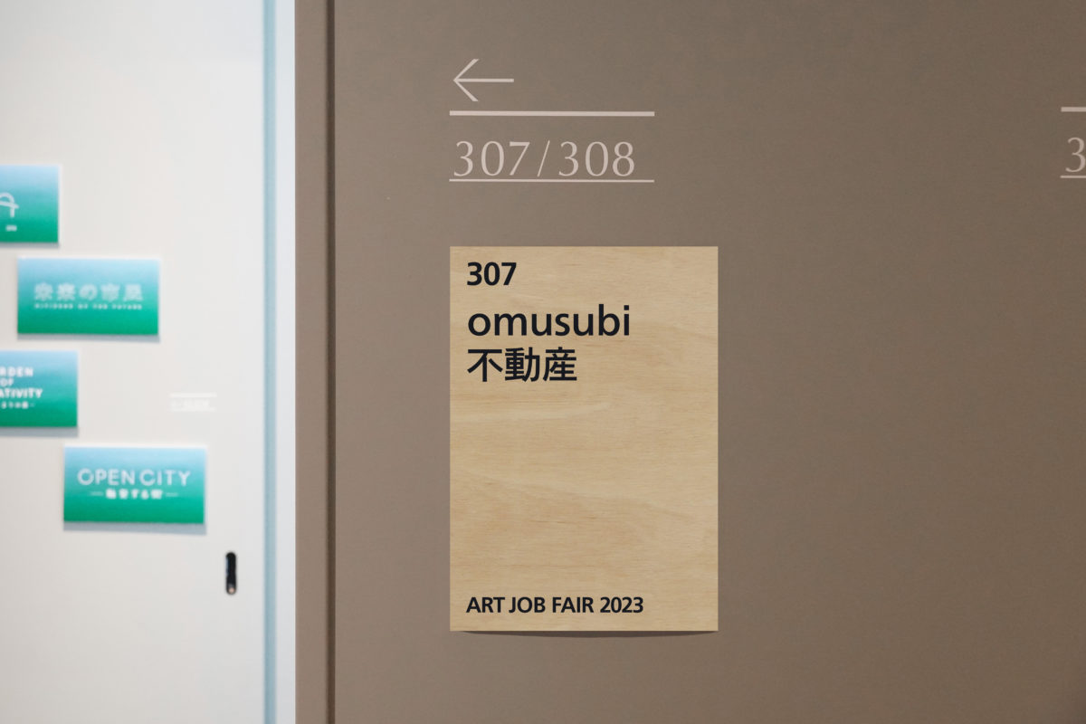
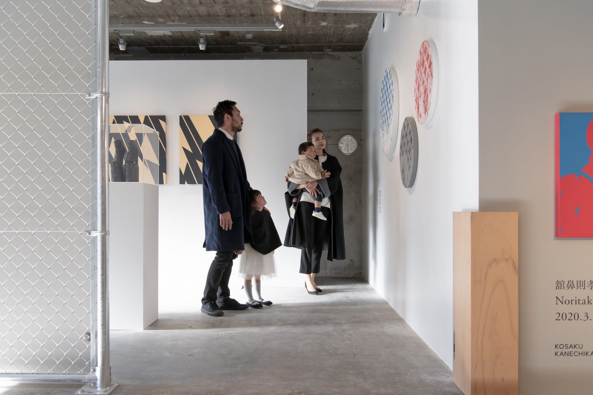
The name of the facility, “Kaika Tokyo by THE SHARE HOTELS,” which is a fusion of art storage and a hotel for the year 2020, reflects the desire to “Kaika,” meaning a visible storage facility, to promote and “Kaika” Japanese art culture, and to support the “flowering” of artists’ talents in the future. The museum is actually home to a number of art galleries. In fact, the museum houses a variety of artworks, including a storage room where several art galleries store their works for public viewing.
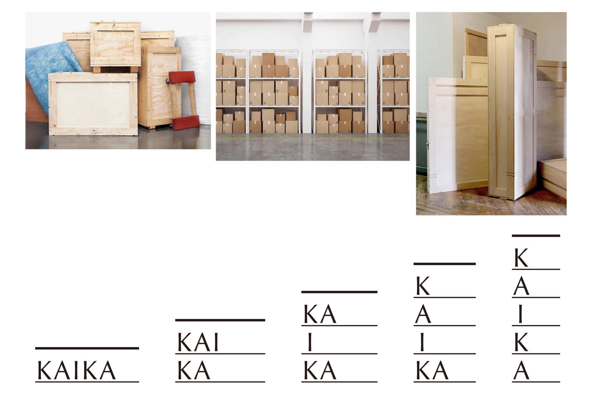
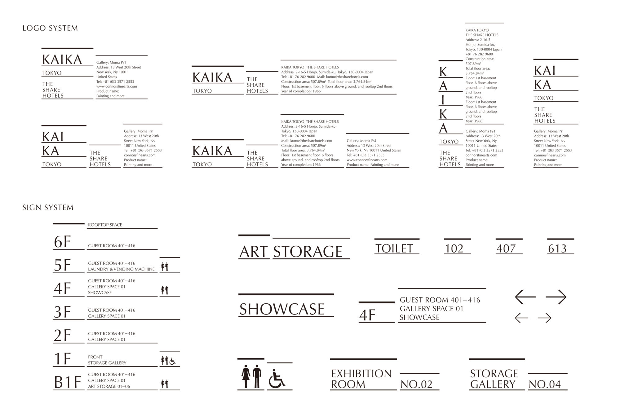
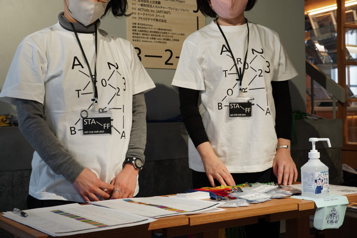
The VI plan was devised based on research into wooden crates used for storing and transporting art works and information printed on the crates, as they were originally used as transportation warehouses. The variable structure of the crates, in which textual information is stacked and arranged in rows, is inspired by the situation in which crates are stored in a warehouse, and this concept is common to everything from signage to price tags on products. In the signage design of the hotel, the original wooden crates were made as the support for the signage, and designed to function as signs while utilizing the appearance of the crates by stacking and lining up the crates. The typeface was selected in a gothic font that evokes the quality of the hotel, and the pictogram follows the elements of the typeface, aiming for a unified design throughout.

more Identities

Gallery 5
- Client
- limArt co., ltd
- Director
- Yusuke Nakajima (limArt co., ltd)
- Design
- Yoshihisa Tanaka
- Architects
- Schemata Architects
- Period
- Apr 2022 – ongoing
- Photo
- Kenta Hasegawa
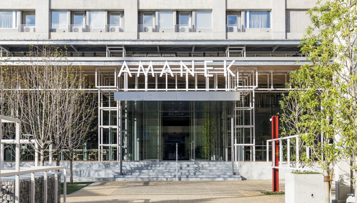
AMANEK in BEPPU
- Client
- AMANEK
- Basic design and supervisor
- SAISEI LABORATORY
- Construction
- Wadagumi
- Low-rise structural design
- Enshu Structural Consultants
- Design
- Yoshihisa Tanaka, Yutaro Yamada
- Photo
- Anna nagai
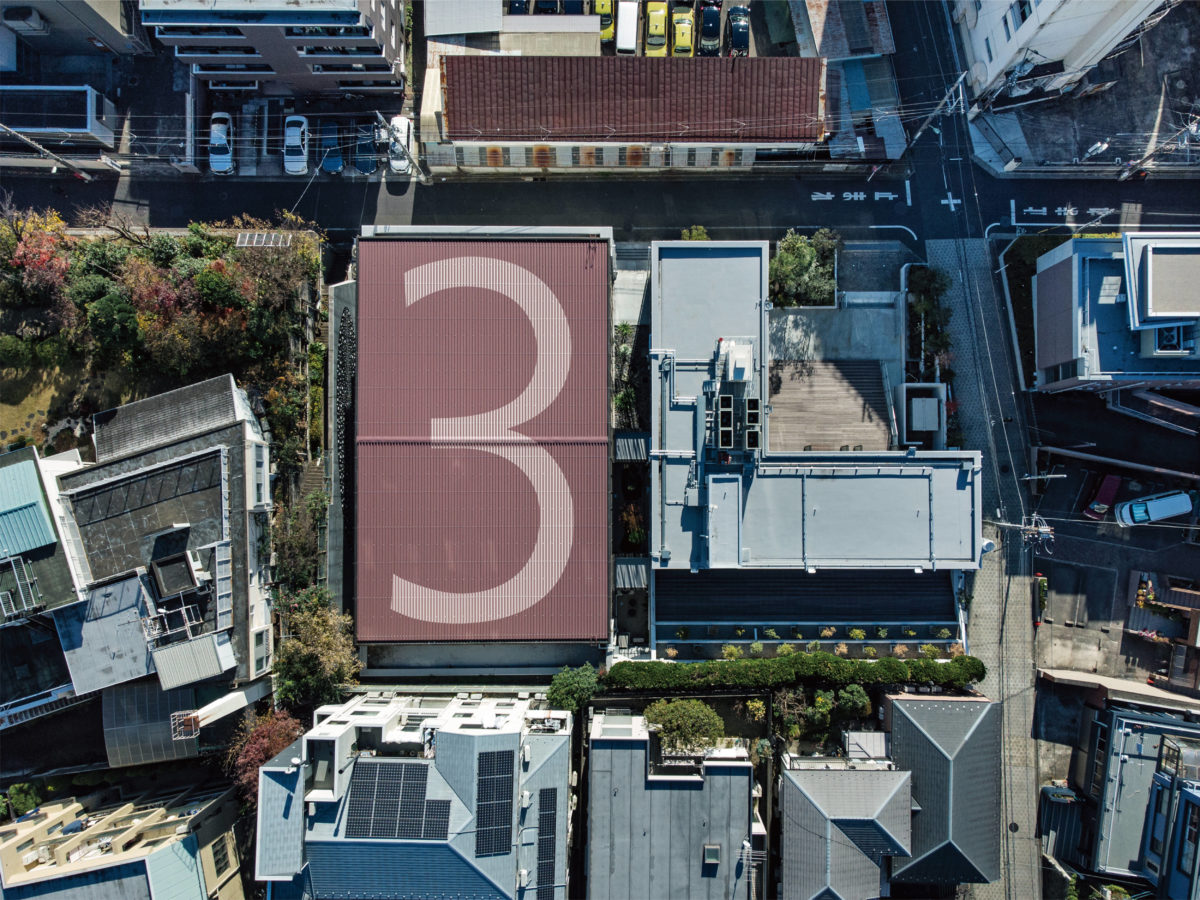
3L
- Client
- Ricoh Company, Ltd.
- Director
- Jun Inada
- Design
- Yoshihisa Tanaka, Yutaro Yamada
- Supervisor
- HIROYUKI TANAKA ARCHITECTS
- Wall drawing
- Hiraku Suzuki
- Web design
- Shed Inc.
- Interior
- TANK Inc.
- Cooperation for sign
- Fujiwara Earthen Art Studio, Paint Factory
- Period
- Oct 2020
- Photo
- Kenta Hasegawa, Den Gai

POST Architecture Books
- Client
- limArt co., ltd, Shinkenchiku-sha
- Director
- Yusuke Nakajima
- Design
- Yoshihisa Tanaka, Yutaro Yamada, Misaki Nishikura
- Period
- Aug 2022 – ongoing
- Photo
- Shinkenchiku-sha